Mechanical Engineers Should Design Our Interfaces

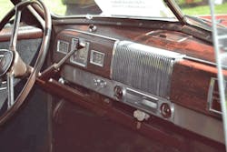
In June 2016, movie actor Anton Yelchin was killed when his Jeep rolled backwards and pinned him to a fence. It’s likely that he thought he had shifted the car into park, but the whizzy new shift mechanism in the car is not a typical mechanical lever that indicates the gear. The mavens of style decided that the new shifter should be a big dual-throw momentary switch (Fig. 1).

1. The shifter in a new Jeep Cherokee does not indicate the gear; that’s done by a little backlit letter. The lever always returns to this center position. (Courtesy of Jalopnik)
You move the shifter forward, and the gear selection is supposed to advance forward, let’s say, from drive (D) to neutral (N), or from N to reverse (R). When you pull the lever back, it selects the next gear in sequence, say, from park (P) to R. The lever always pops back to its centered position, like a big pretty chrome momentary toggle switch. It seems Ralph Nader’s book title Unsafe at any Speed has become literal—this vehicle will kill you in “Park.”
I have noted the lack of modern products’ usability before. These Jeeps don’t have a shift lever, but rather a symbolic encoding of the shift function. I blame the lack of mechanical engineers doing interface design. Once management pushed them aside, products have gotten more and more confusing. Electronics guys like myself, MBAs, finance types, stylists, software people—everyone but degree-holding specialists in mechanical things—are designing our product interfaces. Interface design newcomers are making product decisions and those decisions are killing people.
When I lived in Silicon Valley, I noticed programmers love a puzzle, and they think we all should love puzzles, too. The use of every modern product is becoming like a game of Dungeons and Dragons. You can’t do something because of something else. Nothing is planar, nothing is simple, nothing is straightforward. The youngsters doing interface design all have the eyesight, motor coordination, and reaction times of a fighter pilot, from all those years of playing video games. Now everything is both a puzzle and a skill test.
Designing Then and Now
Bad interface design is directly due to the marginalization of mechanical engineers. A century ago, there were no programmers, or electrical engineers, or marketing types, or focus groups, or finance idiots telling the mechanical engineers how to design things. The result were designs like the Harley K-model, the Duesenberg, the diesel locomotive, and other iconic and beautiful designs.
2. A 1940 Studebaker shift lever tells you the gear by its location. It’s also a prominent important-looking thing, conveniently located. (Courtesy of classiccarpicturesalmanac.com)
A 1940 Studebaker has a simple, elegant, and direct user interface (Fig. 2). Steering is important, and sure enough, the steering wheel is a big important thing sitting right in your lap. The shift lever is a bit less important, but it was still big and prominent and convenient. The emergency brake at your left knee was another big important mechanical thing. The gauges also had an analogy to their importance. Speed is important, and the speedometer is the biggest dial. This was true analog design—the physical mechanisms were analogous to the function they performed.

3. A modern Ford pickup truck keeps many of the user interface cues from that 1940 Studebaker. (Courtesy of ford-trucks.com)
Thankfully, in most modern vehicles there’s still a similitude to those 1940 cars (Fig. 3). The steering wheel is big and prominent, as is the shift lever, still conveniently located at your right fingertips. If an electrical engineer like myself designed a dashboard, there would be a hundred little switches and knobs (Fig. 4). The knobs would all be the same size with no indication of what they were supposed to do.
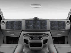
4. A truck designed by an electrical engineer would look like a piece of test equipment. A tiny knob would steer left and right.
Don’t forget that after I’m done, the marketing types and stylists will descend and take away any text (Fig. 5). Everything has to be icons, another non-obvious symbolism. Even hieroglyphics were not a pictographic language; you have to go back another thousand years for that. The Steve Jobs school of sociopath design says that the icons have to be dark gray on darker gray. Contrast is no longer allowed in anything we humans must operate. Contrast is not hip, it’s not edgy, it’s not cool.
5. Steve Jobs has ensured there will be no contrast and no English on anything. Gray on dark gray is the only option. This would be the icon over one of the tiny little buttons that applies the emergency brake.
It was bad enough when electrical engineers came into the user interface world, but then came the programmers (Fig. 6). A truck dashboard designed by a programmer would have one knob and an LCD screen. That yellow faded knob is from the accursed HP 16500 mainframe logic analyzer interface. HP thought it was so cool and neat and tidy and hip. Every single engineer I know hated it.
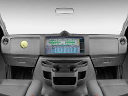
6. A truck designed by software engineers would have a single knob and an insanely complicated screen.
“App”-oplectic Puzzles
When the non-mechanical engineers are done with us, we will operate everything with an “app” (Fig 7). You will have to operate your pickup truck with a phone. The teenagers will love it. The dashboard will finally have arrived at Steve Jobs perfection—no contrast at all, since it’s just blank. All the better to put a big Apple logo onto it. The driving algorithms will be on the “cloud,” so the programmers can change them every three days.

7. One day soon there will be no control inputs on our cars themselves. We will have to use an app.
This is not a new phenomenon. It started when electrical engineers put a clock on the VCR. It was impossible to set, a real festival of puzzlement. My grandfather’s Big Ben clock had a knob you turn to set the time, and another knob to set the alarm (Fig. 8). Product interfaces designed by mechanical engineers have a certain beauty, a certain elegance, that I just don’t see in modern products.
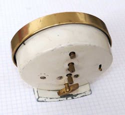
8. Mechanical engineers did just fine with the human machine interface (HMI) of the Big Ben wind-up clock.
My TV has a remote with dozens of buttons (Fig. 9). We used to have a tuning dial connected to a variable capacitor. Now we have stations that the content assigns—so channel 10 is really RF channel 45. Everything is a puzzle and a test. Now you can’t just tune to a station. You have to tell the TV to scan the RF spectrum so that it can figure out what the station frequencies really are. Mechanical engineers would not have architected a convoluted system like this.

9. My older Sharp TV remote (left) has words. Those got replaced by icons on the new 4K Sharp TV remote (right). That any human with an IQ above 80 would think that the public would understand these gibberish symbols is a testament to our capacity for self-delusion.
I have an expensive home-theater receiver. The front panel is 6 by 17 inches. The display that tells me what it’s doing is ¼ inch high. It’s unreadable from a foot away, much less across the room. The front panel is black on black. What is wrong with humanity? Who started this idiocy?
My friend Alan Martin sent me a link about how Apple is removing the 3/32 audio jack from its phones. He noted:
“We’re so out of ideas that actively making thinks crappier and more user-hostile is the only innovation left. I’ve been getting unsolicited remarks from iPhone users that the ‘experience’ of Apple software is headed downhill. I have a general complaint about things that have been optimized and cost-reduced to the point they don’t work anymore. Staplers—even the special ones guaranteed not to jam, still jam. Toasters—properly browned toast takes two or three passes. Toast takes as long as booting Windows 10. Any new kitchen appliance must have line cords that are always too short.”
I lay all this misery at the feet of a society that no longer values mechanical engineering, and lets product design be done by MBAs, finance types, stylists, interior decorators, programmers, and focus groups. I doubt modern business will see the error of its ways. Instead, the maker movement will let a thousand ideas flourish, sprung from the mind of systems engineers like you folks. Once industry sees the proliferation of these designs, they will copy them, perhaps still not understating why people want a shift lever, not a shifter function emulation implement.


About the Author
Paul Rako
Creative Director
Voice Your Opinion!
To join the conversation, and become an exclusive member of Machine Design, create an account today!

Leaders relevant to this article: